
Project at a glance
Challenge:
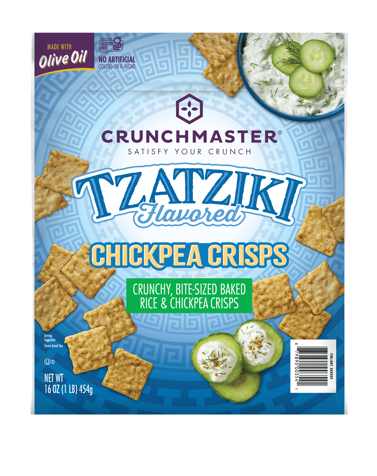
Crunchmaster® wanted to expand beyond its established cracker range into a new line of snacking crisps, starting with a tzatziki flavour. The packaging needed to feel fresh, global, and distinctly different, without alienating loyal customers or losing the brand recognition built over years on shelf.
Solution:
Spark developed two creative routes: a considered evolution of the existing look, and a bold departure that broke the brand’s established architecture. The client backed the braver option. Spark then delivered the full packaging programme in house, from concept through artwork adaptation, legal and nutrition copy, direct-to-printer release, and on-site press checks.
Impact:
The new range achieved Crunchmaster’s biggest sell-in to date, with Costco buying every flavour across the East Coast, West Coast, and Midwest. Demand carried the product into mainstream retail, prompting a new stand-up pouch format, and the project has opened the client up to a more adventurous creative direction across future work.
THE CHALLENGE
Crunchmaster’s brand architecture is instantly recognisable: the logo on a clean white panel, crackers arranged in a signature layout, flavour designator beneath. It works, and it has earned the brand a loyal following in the cracker aisle.
The brief was to step outside it. Crunchmaster was launching a new line of smaller snacking crisps, beginning with a tzatziki flavour, and wanted packaging with a more global feel: garden-fresh ingredients, a tangy profile, Greek-inspired pattern work, and a cool-toned palette of blues.
The new range needed to look different enough to signal something new and worth trying, while remaining unmistakably Crunchmaster to the shoppers who already trusted the brand. Too safe, and the launch would disappear on shelf. Too far, and it risked confusing the very customers the brand had spent years winning.
The timeline added its own pressure. What began as a relaxed development process accelerated sharply once the product started selling in, with new flavours and new formats needed quickly.
THE SOLUTION
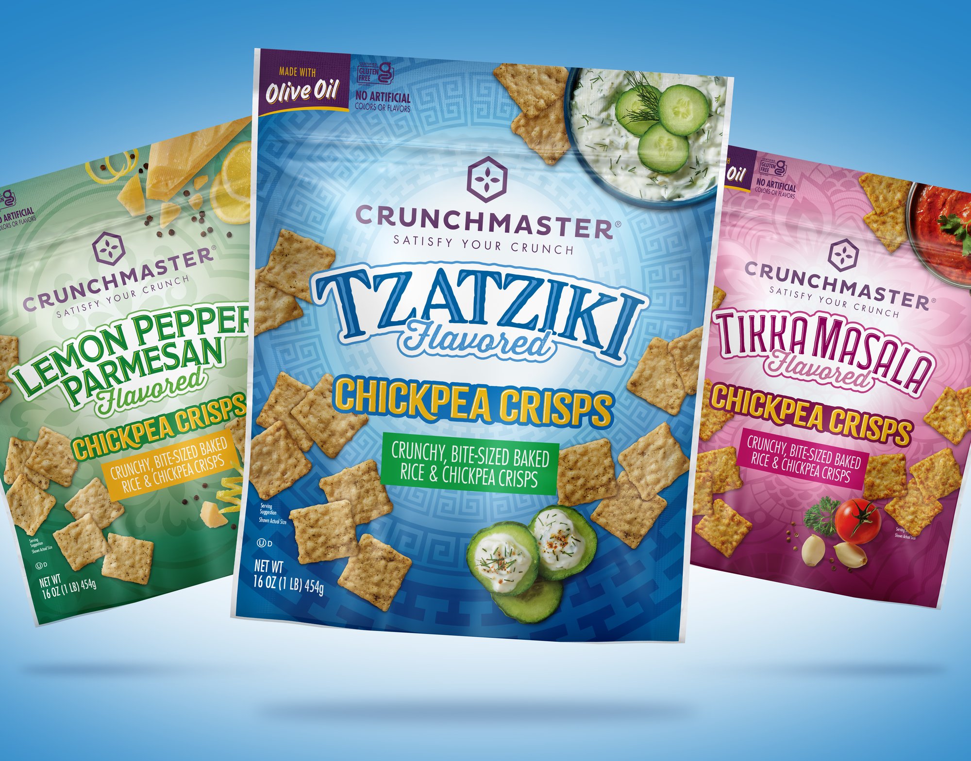
Spark presented two creative routes. The first evolved the existing look, keeping the white panel for the logo while introducing Greek patterning, a rounded layout, and a looser scatter of crackers. The second was a genuine departure: the Crunchmaster logo set in a single colour against a full-colour background, something the brand had never done.
The client enthusiastically chose the braver route. In the presentation itself, one of the Crunchmaster team said once they had eaten the product, they would feel bad throwing out the package because it was so pretty.
From there, Spark managed the full journey from concept to press. Once the front-of-pack design was approved, the team adapted artwork to the client’s dielines across front and back panels, handling all legal copy and nutrition information in house. Release files went directly to the client’s print partner, with Spark reviewing PDF proofs and physical colour proofs at every stage.
For every new flavour and colourway, Spark attended press checks on site, adjusting colour in real time on the production line to make sure what shipped matched what was approved. Even the printers noticed the difference, telling the team how excited they were to be printing something that broke the usual Crunchmaster mould.
Key elements of the approach included:
Two routes, one brave choice
Presenting a safe evolution alongside a bold departure gave the client a genuine decision to make, and the confidence to choose the option that would stand out on shelf.
Familiar, but unmistakably new
Full artwork adaptation in house
Direct-to-print release and colour control
Rapid flavour expansion
When lemon pepper, Parmesan and tikka masala flavours followed, the design platform scaled at pace, adapting quickly as timelines compressed.
THE IMPACT
The new range delivered Crunchmaster’s most successful sell-in to date, and the packaging played a central role in getting it there.
A record sell-in through Costco
Costco typically buys new products into a single region. Every region bought in: East Coast, West Coast, and Midwest, across all three flavours, making it the brand’s biggest sell-in to date. [Sales and distribution figures to follow.]
From club channel to retail shelf
Packaging that earned its place
A braver brand going forward
A platform built to keep growing
Ready to spark your next project?
See how Spark can help accelerate your brand’s presence. Every conversation starts with a tailored assessment, built around your goals.